Method
Software images you can finally read
Ask an image model for a full screen and you get fuzzy fake text and botched alignment. Ask it for one to three components whose words were written beforehand and you get a visual you can post. The bench of October 2, and what it changed in joli.studio.
The photos joli.studio generates are good: a baker at the oven, a workshop at dawn, a customer at the counter. Software images weren’t. We were told so plainly: the photos, great; the interface illustrations, bad.
That’s a problem, because software talks about its product. Its carousel alternates a photo of customers at work with what the app does — a table filling up, a request approved, a roadmap moving forward. Without an image of the product, all that’s left is photos of laptops.
Why a full screen fails
Our interface prompt asked for what seemed reasonable: a screen of the app, rendered flat, with blurred text so as not to write nonsense. That was exactly what an image model does badly.
A full screen means dozens of labels, numbers and alignments to make up at once. The model replaces them with gray lines, dots and charts that measure nothing. The eye recognizes software, but not this software, and nothing can be read. Worse: the image type was guessed from the text. A word like “dashboard” in the description of a photo was enough to tip the image into an interface.
The bench
On October 2, 2026, we took three software brands from our test database and nine slides — banners, background images, narrow columns — and generated each one twice: with the old “full screen” prompt, then with a new approach. Eighteen images, $0.23 in all.
The new approach comes in two steps. First, a text model reads the slide, picks one to three components of the interface — a card, a notification, a chart, a table row, a button — and writes their text: two to six words per line, in the post’s language. Then the image model gets that brief and a marketing-visual instruction, like a software launch page: large, crisp components, rounded corners, soft shadows, and the words in quotes to be rendered exactly.
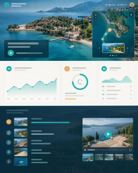
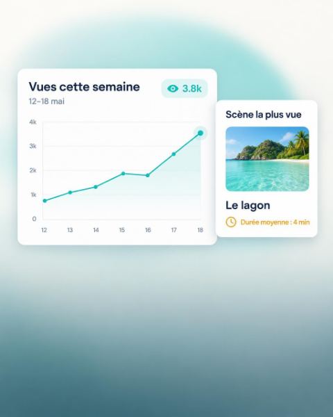

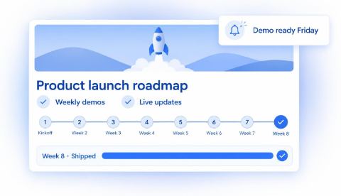
The “components” approach wins clearly, as a banner and as a background image alike. The text reads, and it says something: “Vues cette semaine,” “Scène la plus vue,” “Demo ready Friday.” The image no longer looks like any software at all: it shows a feature.
The image model botches a screen it has to invent. It nails three components whose words it is given.
What else the bench taught us
The approach had its flaws, and each one became a rule of the brief:
- A narrow column can’t hold three components side by side: it gets just one.
- People added to the visual, a hand holding a phone: no people, no hands, no devices, no desks.
- The same message twice, in the card and in the notification: never say the same thing twice.
- Made-up addresses, a domain that doesn’t exist: no invented address and no invented brand name.
- Generic thumbnails, a stock-photo landscape in a card: a thumbnail follows the brand’s photo style.
And a question of honesty. Sample numbers in a chart or a card are marketing, and that’s fine. A number in the spotlight that isn’t on the slide, never.
What changed in joli.studio
An image style now has a type — photo, illustration, product or graphic — that you choose and that decides the rules sent to the model. Nothing is guessed from the text anymore. The product type goes through the components brief before every image, and its text follows the post’s language.
So the components look like your product rather than software in general, a product style can carry up to three screenshots of your app. They go with every image in that style: the model picks up your shapes, your corner radii, your density, your typography — and never copies a screen.
The analysis of your website knows this too. For software or a digital service, it suggests two styles: a photo of your customers at work, and a product style. Tried on the site of a payroll and HR software, it came back with “Portraits au travail” and an “Interface” style named after the product, and the second one’s previews came out with their words in French, legible: “Absences à venir,” “Approuvé,” “Horaires enregistrés.”
And since every image picks its own style, a carousel can alternate the two. Generating a post puts the photo where there are people, the product where there is a feature, and each style keeps its own series: the photos look like each other, and so do the product visuals.
What it costs
The components brief is a short call to the fast model: under one Spark, counted with the image in the estimate shown before you generate. Each attached screenshot counts as an attached image, at the price of a reference sheet. Creating the style itself — writing it and seeing its three previews in your brand — is estimated at 5.
The step-by-step is in the Guide: create an image style, then generate a consistent image series.